
The Finishing Touches That Make Print Feel Premium
In a crowded marketplace, tactile impact often makes the difference between packaging that gets discarded and packaging that gets kept. Post-press finishing transforms ordinary commercial ink on paper into a memorable brand asset.
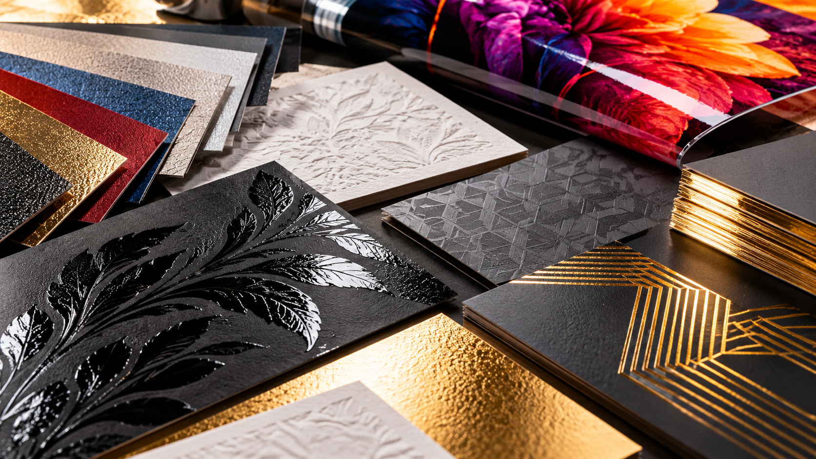
011. Tactile Contrast: Soft-Touch vs. Spot UV
The most captivating packaging combines tactile opposites. Soft-touch matte lamination creates a velvety, non-reflective base that absorbs light, while high-build spot UV gloss over selective typography or logos provides high-gloss reflection and raised physical texture.
This contrast invites touch and instantly signals premium craftsmanship.
“People read print with their eyes, but they value it with their fingertips.”
022. Hot Foil Stamping and Metallic Embellishments
Traditional metallic inks reflect diffuse light, but hot foil stamping uses heat and brass dies to fuse real reflective metallic foil onto the sheet. Whether warm champagne gold, bright mirror silver, or copper bronze, foil adds an unmistakable edge to labels, luxury boxes, and certificates.
“Finishing is not an afterthought — it is the moment print transitions into an object.”
033. Embossing, Debossing, and Structural Scoring
Sculptured multi-level embossing brings two-dimensional artwork into three dimensions. Clean, precision creasing and matrix scoring protect laminated folds from cracking along spine edges, ensuring the finished piece maintains structural integrity across its life.
Key Takeaways for Printers & Designers
- ✓Combine matte soft-touch backgrounds with high-build gloss spot UV for maximum tactile contrast.
- ✓Hot foil stamping delivers specular reflection that metallic inks cannot match.
- ✓Precision creasing prevents laminate cracking on heavy board packaging.
- ✓Always verify wax compatibility between inks and subsequent lamination coatings.
Need help choosing the right material for your print job?
Talk directly with our pressroom consumables and ink specialists in Nairobi.
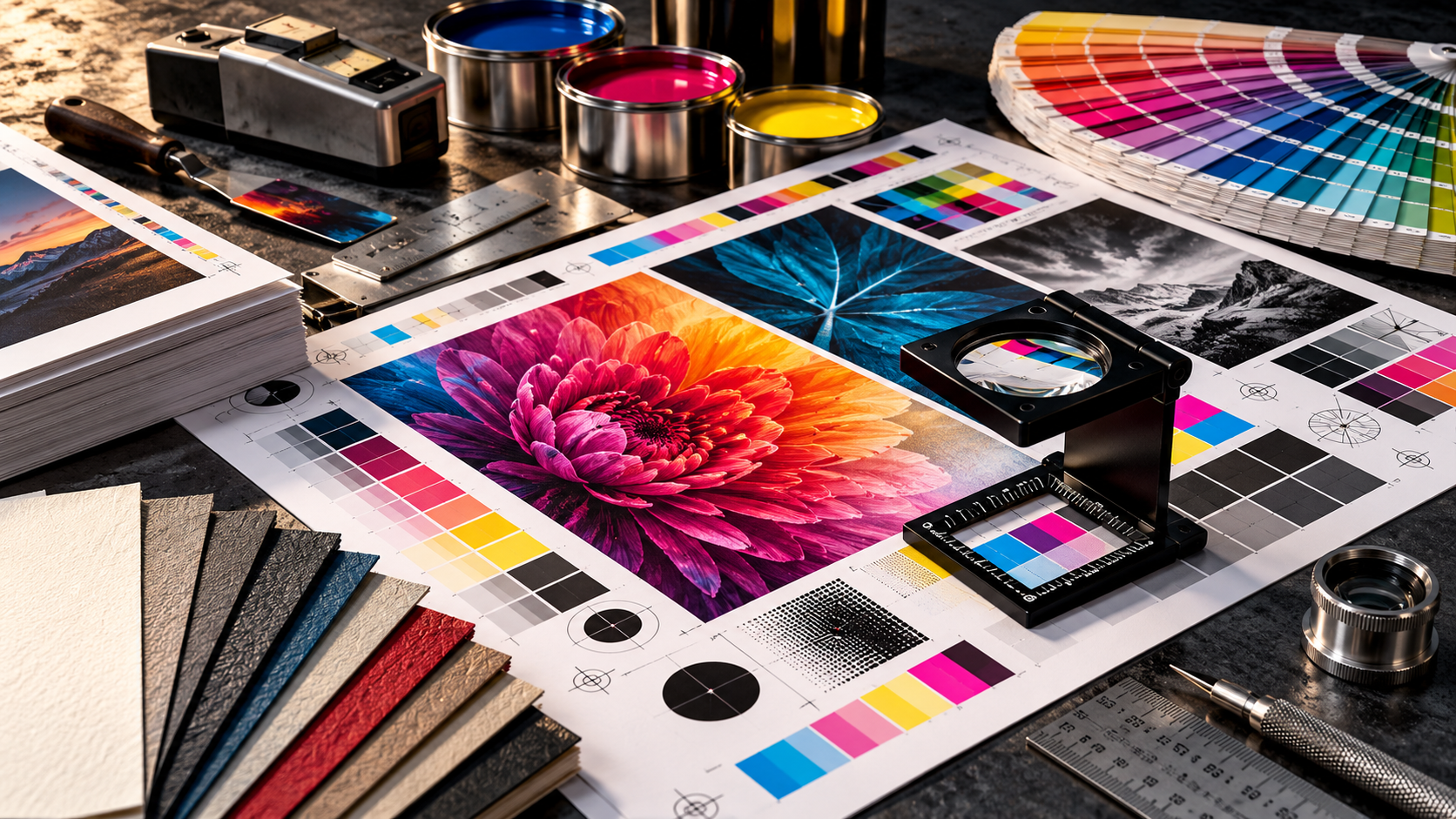
Why Colour Changes from Screen to Print
What looks perfect on a screen can shift once it reaches paper. Learn the practical reason colour changes between digital artwork and printed output, and what to check before production starts.
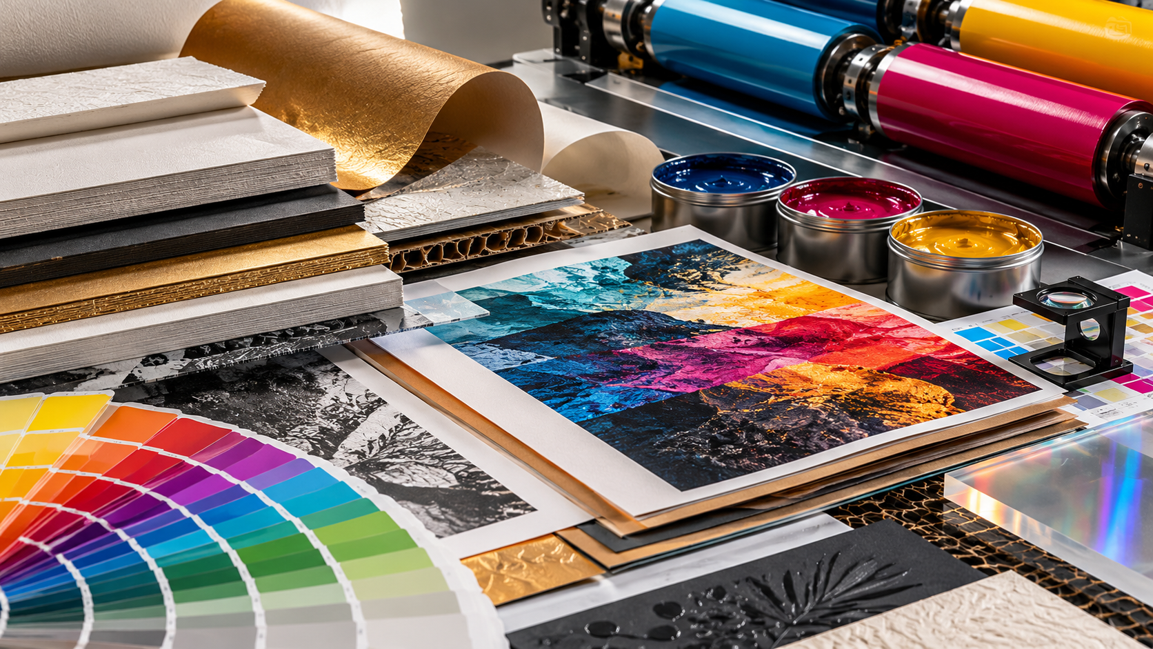
How to Catch Print Problems Before Production
Many costly print issues can be prevented before the job goes to press. This article explains the simple checks that help catch colour, file and proofing problems early.
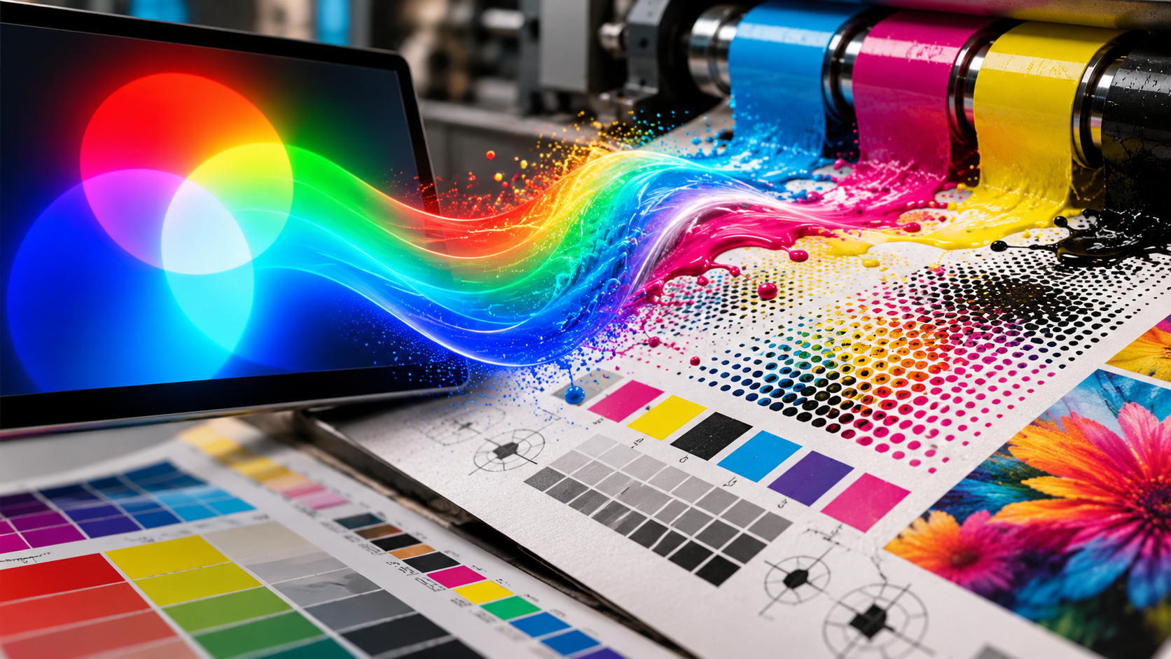
The Right Material Is Only Part of the Job
Great print results do not come from material choice alone. Ink behaviour, press setup, finishing and application all work together to determine the final outcome.

How to Approve Colour Before It Becomes a Costly Print Problem
A fast practical guide to checking proofs, ink behaviour and expectations before a job goes to press, so colour decisions are made early and correctly.
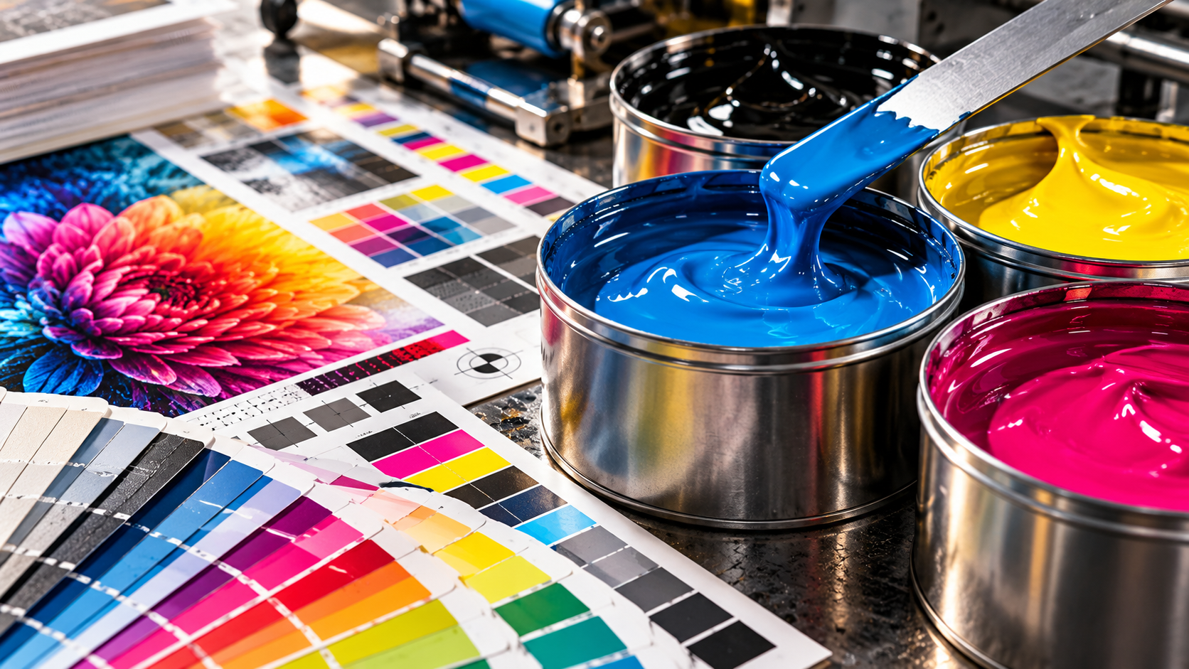
How the Right Substrate Changes the Entire Print Result
Paper, vinyl, board and specialty materials all react differently. Learn how substrate choice affects colour, texture, finish and final print quality.